Behind the Brand: Ade + Ayo
Brand Statement
Ade + Ayo is a conscious children’s goods brand that brings the warmth, vibrance, and innovation of African design to children through clothes, accessories, decor and toys.
Brand Values
Culture, Community, Kindness, Joy
Brand Buzzwords
Vibrant, Kind, Rooted, Modern, Playful, Everyday
More about Ade + Ayo
Ade + Ayo is positive force of joy, creativity, and a celebration of culture. Its key phrases are “culture meets play” and “beautiful, affordable, kind”. It seeks to give parents the opportunity to surround their children with designs that remind them of Home in a way that is affordable for the parents and comfortable for the children. The “kind” stems from their committed to sustainable practices, fair trade/good manufacturing practices, and eco-friendly packaging. It also gives back a portion of its proceeds to a community in Uganda that cares for underserved youth.
It connects its audience to a larger purpose and community, and its founder, Temidayo, reached out to us with the honor of helping align its branding to its heart, goals, and mission.
Process & Creative Direction
I was immediately drawn to the heart and values behind Ade + Ayo from my first conversation with its founder, Temidayo, an incredibly inspiring Nigerian-born, first-time mama who sought to weave the beauty of her deeply rooted African culture through her own son’s first memories. Temidayo sought to create a brand founded on the principle of “culture meets play” – a real, practical, livable brand that can be naturally incorporated into a family’s lifestyle and add value and a deep sense of community, while also being rooted in kindness and joy. From the start, we knew that this would be a very special project and one that should stand out in its industry for its warmth, joy, and kindness to draw together families from around the globe.
We sought to make its audience feel like they’ve entered a celebration of culture and childhood – one that they want to bring home with them and continue to celebrate. We wanted to give it a slightly handcrafted feel, as if it were lovingly made by a neighbor, friend, or family member – for each shopper’s own child. It should make children feel valued, cherished, and uniquely appreciated, while also connecting them to a much larger community. We wanted it to feel vibrant, kind, rooted, modern, playful, and inviting, while also remaining rooted in culture and memorably unique.
Visual Inspiration
The visual inspiration for Ade + Ayo is rooted in African art, music, and culture. It is full of life and energy, and brings joy to the people that come in contact with it. Vibrant hues, energetic patterns, playful letterforms, and natural textures play key roles in its visual presentation. Ade + Ayo’s color palette should feel derived from natural pigments and dyes –rich tones that are full of life and energy. It should feel like entering a celebration or the middle of a dance, a place where they are welcomed to join and leave inspired. Art, music, and play are at its core – it should feel rhythmic, lyrical, and handcrafted by a group of people that love and care for its recipient. It is confident enough to use the patterns and colors that some may shy away from, and it does so in a way that is artful and memorable. It juxtaposes color, pattern, and texture in a way that mimics a dance of people from around the continent – all coming together in a way that is harmonious, lively, uplifting, delightful, and inspiring.
Primary Logo
For the primary logo, we created a custom rounded, sans-serif font in order to better communicate Ade + Ayo’s brand values. The “a” and “y” were fully custom drawn letterforms – the “a” in order to create a more “grounded” and elevated feel, and the “y” to give it a friendly rounded tail that “smiles” back up (speaking to the joy aspect of the brand) and aligns comfortably towards the “a”.
The patterns on the letterforms stem from the beautifully vibrant nature of African art and the celebratory feel of the Ade + Ayo brand. The hidden “sun” mark in the letter “o” also speaks to the brand’s bright and encouraging nature, and is repeated throughout the brand through subtle sun additions in brand patterns, stickers, and various collateral details. Together, these elements create a warm, inviting, joyful, and playful look and feel, and is a peek into a bright, vibrant, artful, and a beautifully patterned culture experience.
Brand marks
The elephant mark of Ade + Ayo ties back to the brand’s original mark, but in an updated way that is cohesive with the family of logo marks – for example, with rounded shapes within it and a swooping rounded upwards trunk, to mimic the “y” in the “Ade + Ayo” wordmark. It is friendly, fun, playful, and memorable – especially when used alongside brand pieces / textures / elements.
The brand also utilizes a small sun symbol taken from the hidden sun symbol within the “o” of “Ade + Ayo” in order to add an extra element of childhood joy,
Color
The color palette we selected is warm, vibrant, and earthy in order to draw its audience in while making them feel at home. All palette choices were drawn from natural pigments – vibrant hues that could be made by hand from the earth.
Brand Patterns
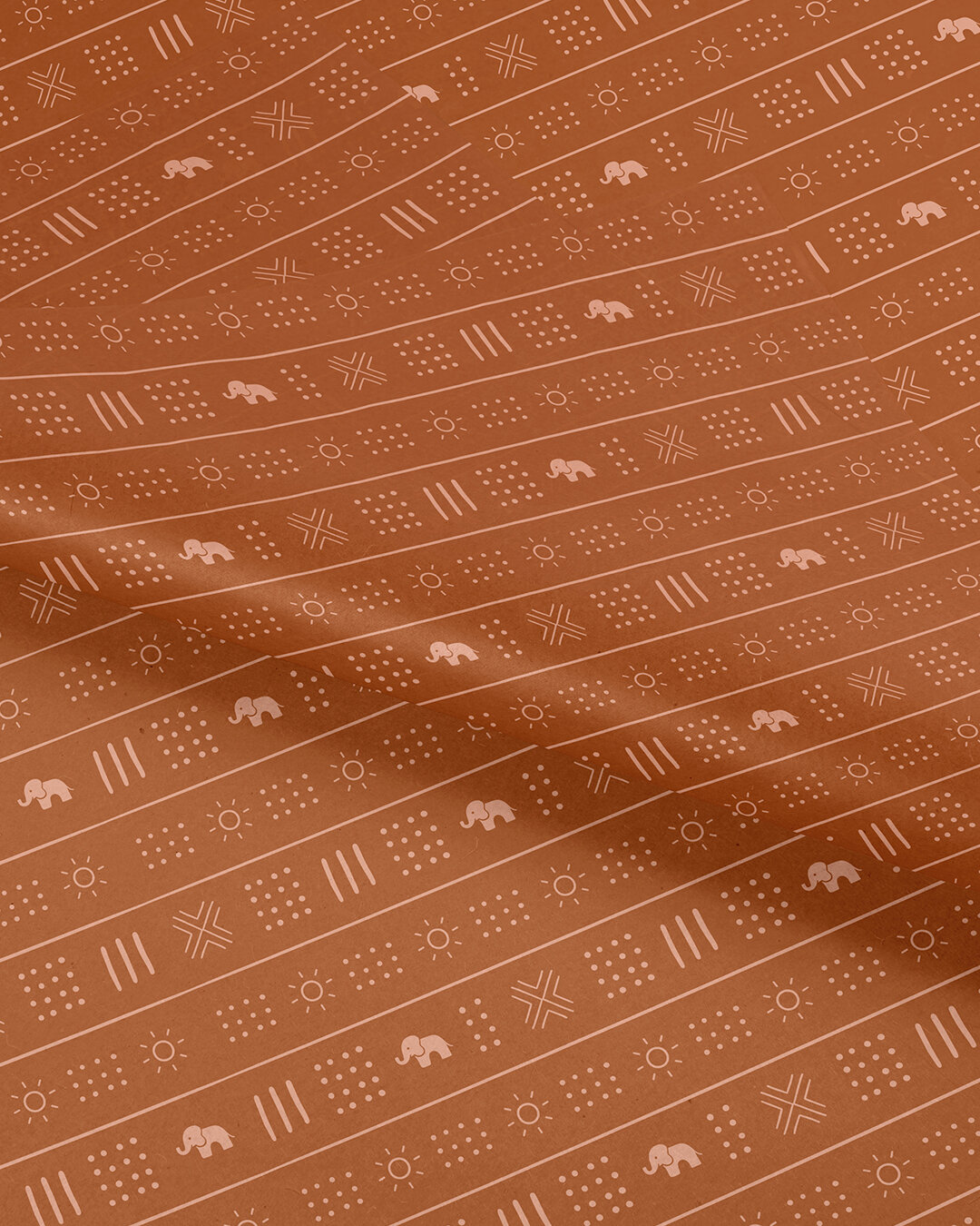
The brand patterns of Ade + Ayo add a handcrafted, tactile quality to the brand in order to give it a more personal, handmade feel while adding memorable details that expand on the Ade + Ayo brand vision.
For the main pattern, we looked to African mudcloth textiles for inspiration. These would traditionally be narrow strips of woven cloth hand-stitched together to form a whole piece. The cloth would then be hand printed with patterns and symbols using a variety of natural dyes from mud and plants, making each mud cloth fully unique. For our version, we incorporated the brand elephant mark and the sun mark from the “o” of Ade + Ayo.
In addition to the main pattern, we created a subtle pattern texture that would give a similar handmade feel as a simple background element. It would look like hand-weaved fabric for things that may be less tactile – it could be used digitally or on simple matte paper for instance.
These patterns create a warm, playful, and artful experience with nods back to traditional pieces, while also creating a more personal, handcrafted experience for the Ade + Ayo community.
Collateral
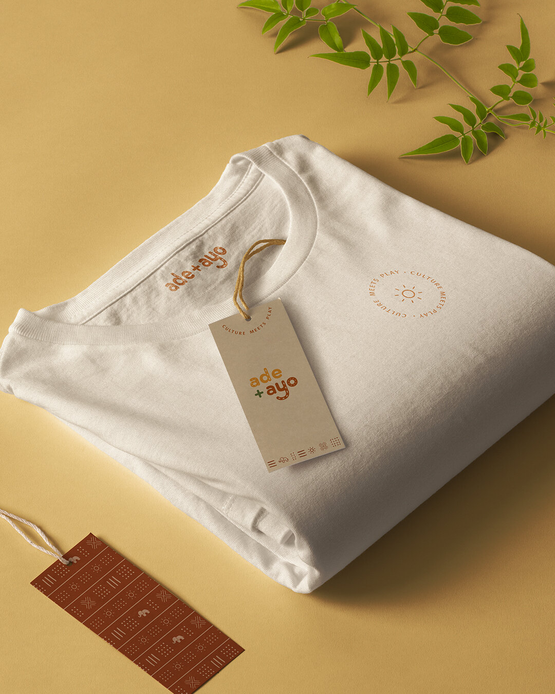
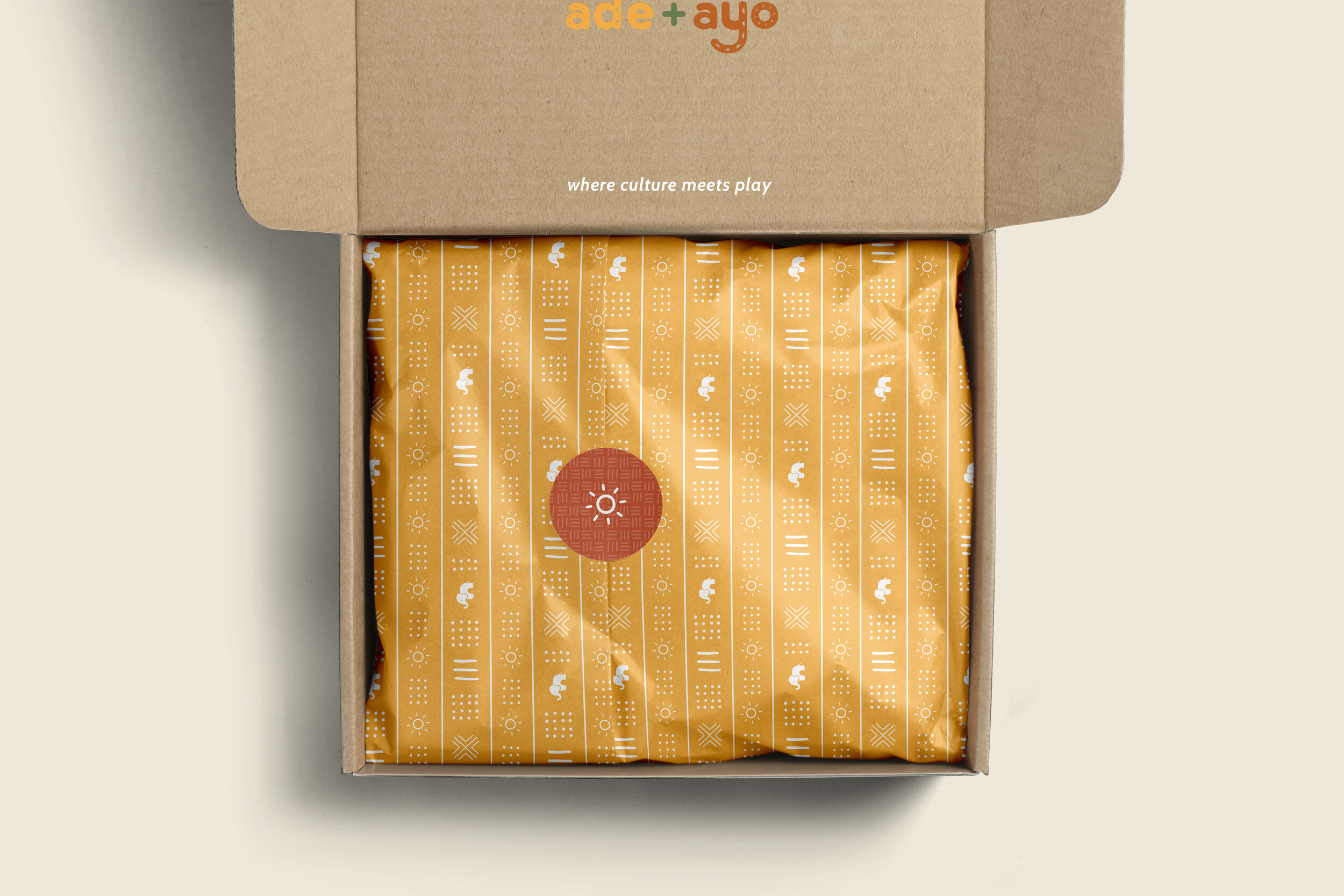
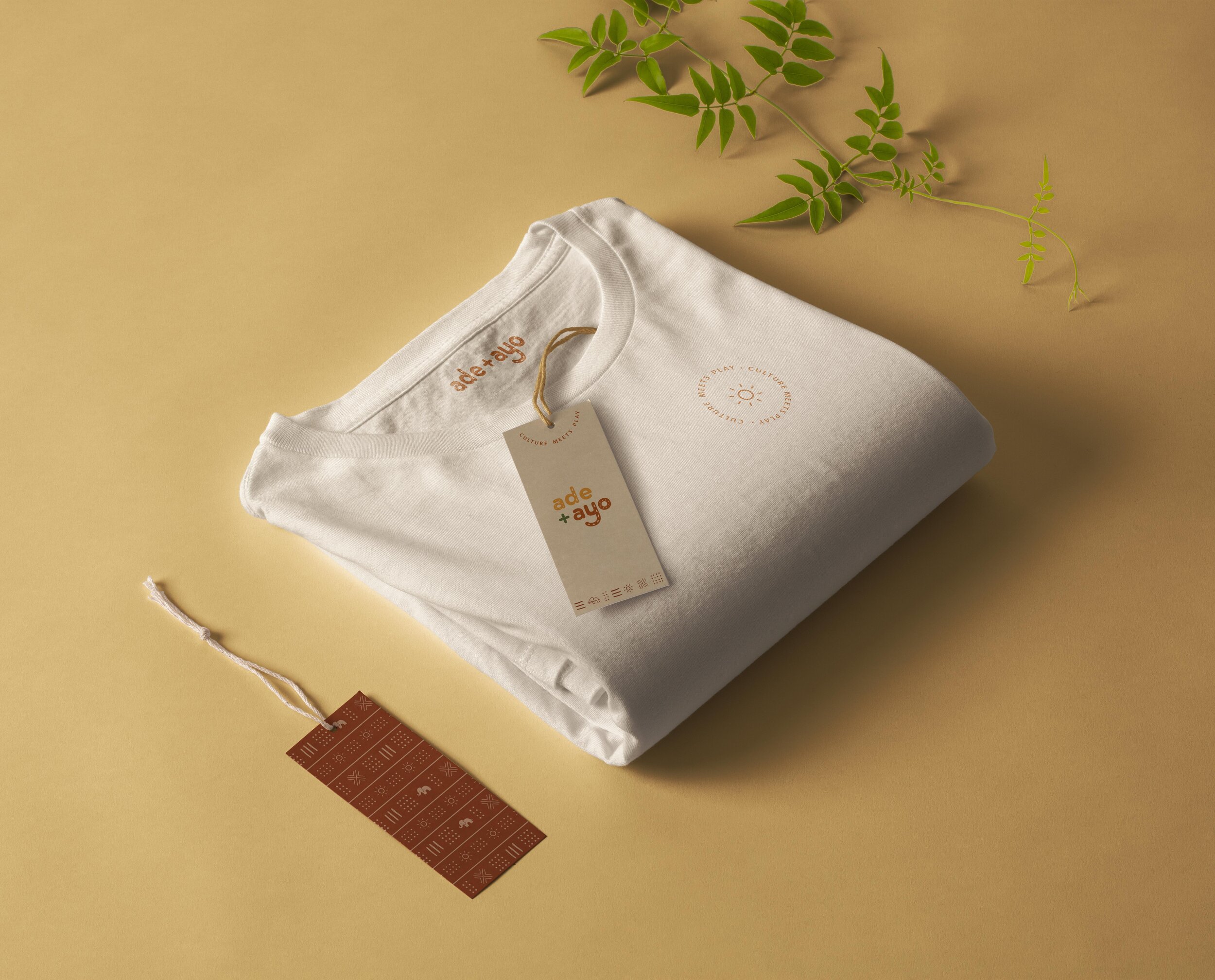
The collateral for Ade + Ayo included packaging, hangtags, custom tissue paper, stickers, and social media graphics (branded Instagram highlight covers, Instagram post & story templates, and profile images). Goals were to make every point of contact with the brand feel personal and reflect all of the brand buzzwords and values.
Kind Words
“I am so glad I chose to trust Bonica Design with my brand strategy and visuals! From our first meeting until I received the final documents, Bonica Design was such a joy to work with. Steph is not only a talented visual artist, she is also an incredibly attentive listener. The initial brand questionnaire asked such great questions, helping me to clarify my brand’s vision and messaging. The team then took to heart the vision, goals and heart of my brand and created a strategy that would provide a strong foundation for my brand moving forward. I felt that my brand was well cared for, as Steph took responsibility for bringing my vision to life with beautiful, well-aligned visuals. She recommended collateral items that I hadn’t even considered, fully immersing herself into the mind of my ideal customer and thinking through what that customer would find most compelling. The brand elements Bonica Design created made me gasp. I absolutely love them and feel completely heard and understood. I came to Steph with a feeling and a hope; she turned them into a reality. I cannot recommend Bonica Design enough! I’m eager to keep working with them as my brand grows.”


